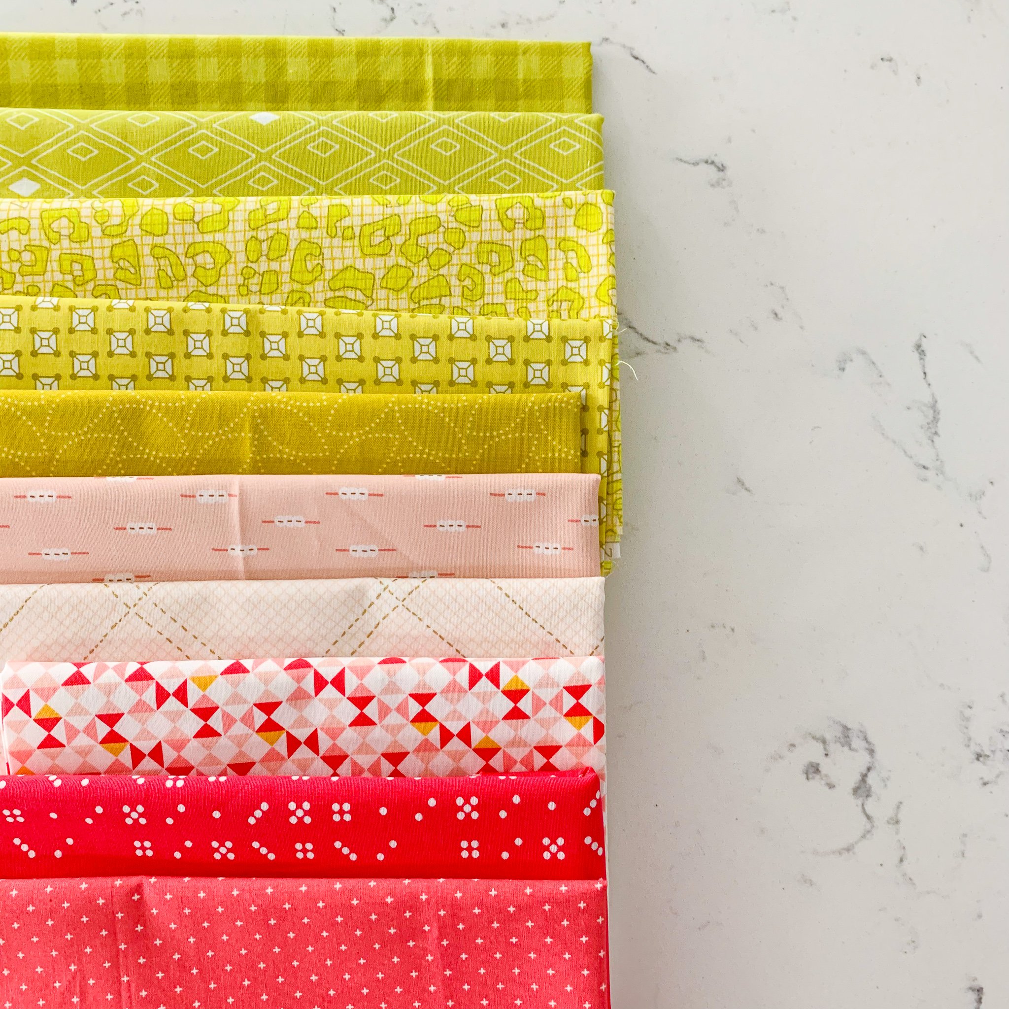
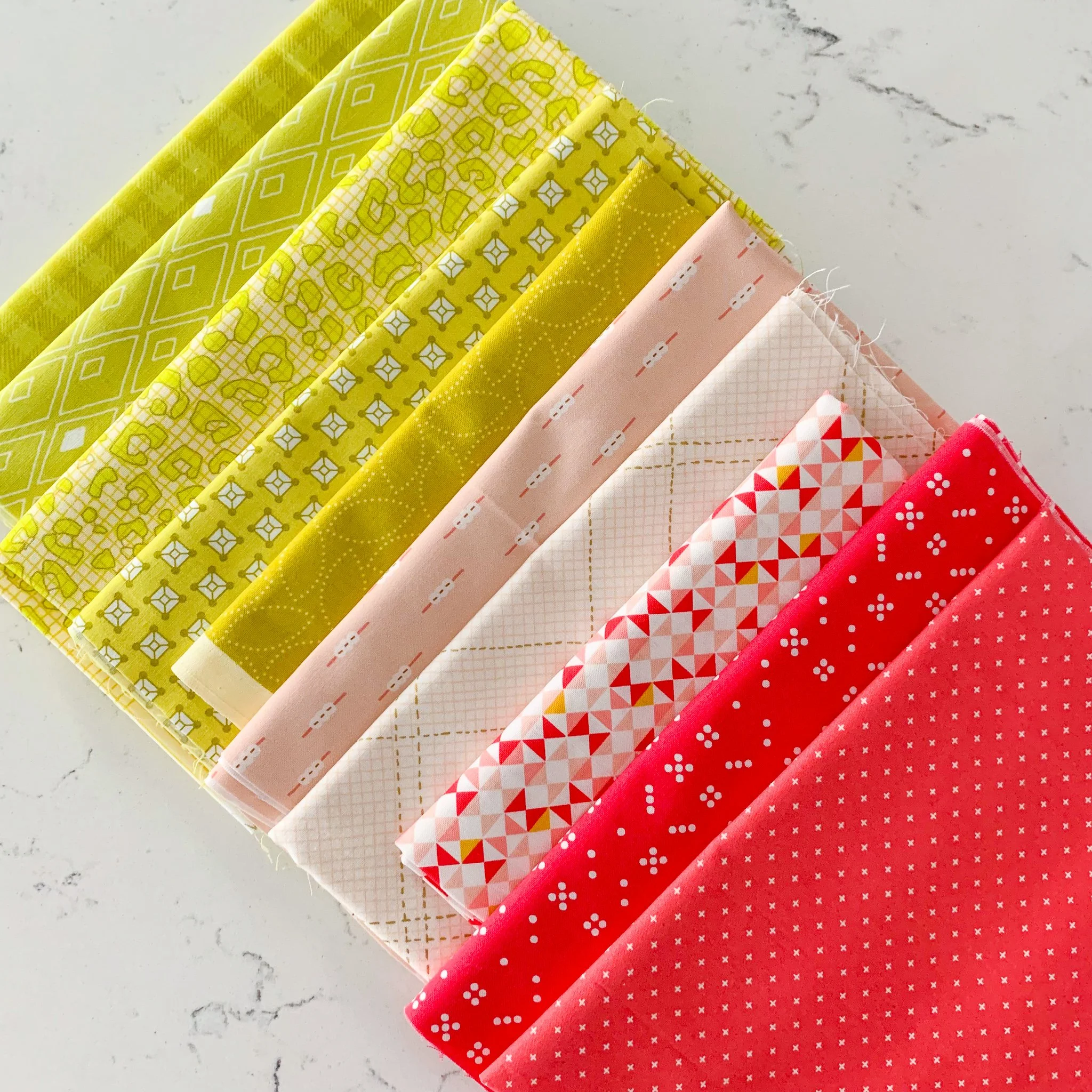
Fabric Palette Friday #16: Spring Melon
Happy Fabric Palette Friday! I probably say this a lot, but this is one of my favorite bundles. I named it Spring Melon because, on one hand, it makes me think of honeydew and cantaloupe, but really, it’s like a drippy popsicle on a summer day — sweet, joyful, and uplifting, which is honestly just what the doctor ordered after a week of terrible news for our nation.
Looking at the bundle, you might imagine I started with the hourglass print since it contains both the berry pink and citron colors, but the bundle actually began from a desire to make a palette that highlighted citron. This fabulous yellow-green is one of my favorite colors, and I started pulling a range of prints showcasing it to get things started. Unlike many of the Fabric Palette Friday bundles, I decided to go with all prints on this one — no solids or textured wovens in sight. The key to making an all-print bundle work is to stick with small-scale prints so that nothing jumps out too much or draws the eye. This bundle wasn’t about a signature inspiration print but about highlighting the fabulous colors.
Regardless, it’s still important to include a range of hues to give the bundle range and various places for the eye to move to and settle. In this case, the pinks range from a cream print with a very pale ballet-pink crosshatch to the darker strawberry shades. The citron prints are more saturated, but I tried to include prints that included varying amounts of white/cream within the print. For instance, the Carolyn Friedlander animal-y print in the middle reads as much lighter because it has a lot of pale-yellow background, while the Denyse Schmidt leaf print all the way to the right (in the citron section) reads much darker because there’s very little white in it.
Leave a comment and let me know what colors you’re working with this week. Then join in on Instagram using #fabricpalettefriday to share your own creations!


